Themes: Application Properties

The Application element contains parent and system-wide configuration settings.
How do changes affect existing applications in the Application Designer?
- Vaules set in Mobile Themes apply to newly created child items in the Application designer.
- Defaulted values "(Default)" will be updated.
- Locally set values are not changed.
Active Focus - This sets the default value for all editable control's focus state at runtime or during test. If ActiveFocus is set to True, all controls will have focus except when there is an override or if the control doesn't allow focus. If HideBorders is set to True, only the control that has focus will have a boarder and those that don't will not display a border around the control. If HideBorders is set to False, then all controls will retain their borders regardless of whether they have focus. See DisplayMode to set the default styles by the type of displaymode.
BackGround Property - has four categories for setting the background color: Solid, directional, Transparent, and None. Solid applies BackColor and ignores BackColorEx. The Directional (Diagonal Right, Diagonal Left, Vertical etc.) applies BackColor and BackColorEx in a gradient direction. Transparent allows the background color from next closest parent or container behind the control to show through. None is similar to transparent as it ignores both BackColor and BackColorEx. Most controls will also have a (Default) value that appears in colored text. This value uses the Theme > Application > BackGround settings.
For details on BackColor and BackColorEx, see Graphical Properties Definitions.
BackImage allows you to stylize the background image on a form. If the customer has an company logo, you can use these properties to stylize its appearance on the form.
DisplayMode - While all the other properties are used to set the normal look/feel for all applications, the DisplayMode is only used to stylize these application modes: Attention, Bold, Disabled, Error, Focus, Information, Link, Success and Warning. Each property group includes an Override property which only applies the values at the current prompt if set to True. For example, if the Focus BackGround = (Default), and the Override = False, then the BackColor values will use the values from the Application > BackGround and not use the BackGround values set for Focus. For more detail, see Theme States.
FontName - the font family to be used. This is the ONLY location where you select the font type. The selection here is global to all the other controls.
FontSize Property – (for graphical mode only) defaults to a baseline value called "Normal" which is set in Mobile Themes > Application > FontSize. You increase or decrease the font size (in points) if you want to override the default value. For example, if your Normal = 11 points but you want your Labels > Caption text = 14 points, you would set your Labels > Caption > FontSize to +3. In controls where the FontSize property is nested into subproperties, you may see "Inherit" used instead of "Normal"
ForeColor- sets the font color for all controls when its set from Mobile Themes > Applications. For state based coloring of fonts (ie. Error messages) see Themes.
Heading - sets the look and feel for the form's heading/heading and the positioning of text and icons (icon buttons) in the heading. Note that the form heading is not the same as Status Bar which can also display at the top of a form. Its nested properties include: BackGround, BorderStyle, FontSize, FontStyle, ForeColor,and Margins. Pressed will stylize how the control looks when its selected by the user.
SystemColors - This is a system-wide function which is used to setup color themes that can be accessed by other properties within Mobile Themes and from the Application Designer.
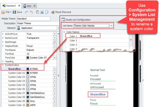
See To rename a system color for more details..
SystemIcons - are used to associate a system action (i.e. Call Event, Call Form) with the icon, which is placed in the Application header. The alignment and margins for these icons is performed in the Heading > Icons property. For more details see Manage Icons Collection.